


Project details:
15 weeks

Researcher &
Designer

Oliva Biordi | Designer

Sara Hall | Creative Director
Figma

Adobe
Creative Cloud
Google Scholar
The why?
Accessible and inclusive design for local government websites is essential because it ensures that all residents, regardless of ability, can access crucial information and services. This isn’t just about meeting legal requirements—it’s about enabling marginalized groups, often overlooked in traditional design, to engage with their local government. When we prioritize accessibility, we’re making sure that everyone, from those with cognitive challenges to those with physical disabilities, can stay informed and participate. In a city like Philadelphia, where nearly 17% of people need some form of accommodation, it’s especially important to design inclusively. This not only enhances user experience but also builds trust, fosters equity, and creates a truly inclusive community.
The who?
Bella Vista is a home to nearly 40,000 people in a city of 1.5 million. A home where young people settle in for a lifetime. When designing, it’s easy to get caught up in the aesthetics and have function follow form. When designing for a local government website- you have to toss that thought process aside and have form follow function. Bella Vista is a neighborhood in Philadelphia, PA known for its vibrant livelihood, diverse population and hugely popular Italian Market. It gives a lot of people just what they’re looking for in a city— a dash of city life with plenty of quiet residential space.
Meet the people who make Bella Vista, Bella Vista.
Demographics


38,809 Residents

68% White Residents


93% White Collar Workers
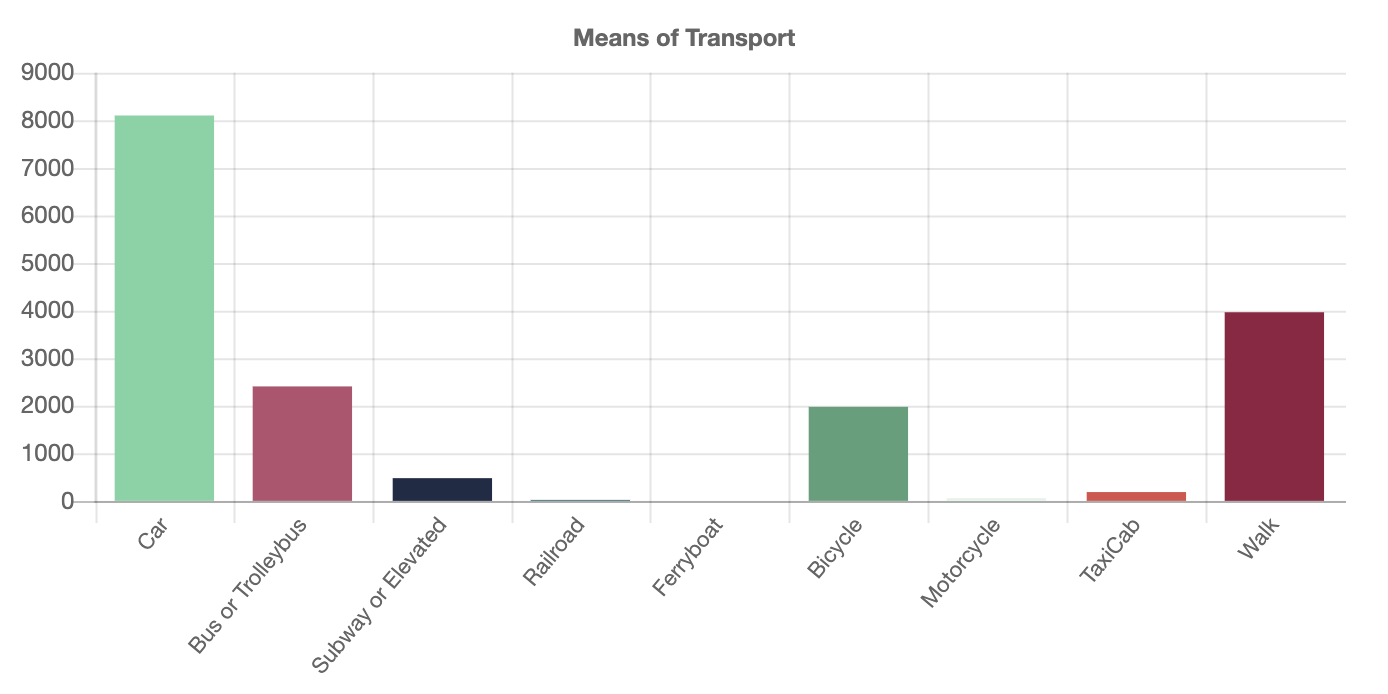
Car Users
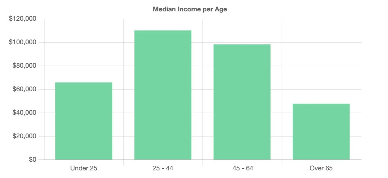
$86,147 Median Household Income
Empathetic designing
In our design process, we prioritized serving those who rely on local government websites, focusing especially on vulnerable individuals who need clear and fast access to information. To truly understand the community of Bella Vista, I made a point of immersing myself in its environment. I explored the lively Italian Market, where narrow sidewalks brim with vendors’ shops overflowing with energy and delicious food. Just a few steps away, I discovered serene streets lined with gardens and parks, perfect for community events—yet some of these opportunities seem to be overlooked.
By experiencing the diverse dynamics of the neighborhood firsthand, I gained a deeper understanding of the people I was designing for. This insight led me to research more about the area’s demographics, revealing populations that often face barriers:
-
Non-citizens
Individuals without a college degree
Individuals aged under 25 or over 65goes here
-
Self-employed workers
Divorced/separated residents with children
People living with disablities
-
Reliable public transportation is crucial for:
Self-employed individuals
Government employees
-
Community services like child-care assistance
Access to affordable programs
With these insights in mind, I was able to create a more personalized user persona that reflect the real needs of the community.


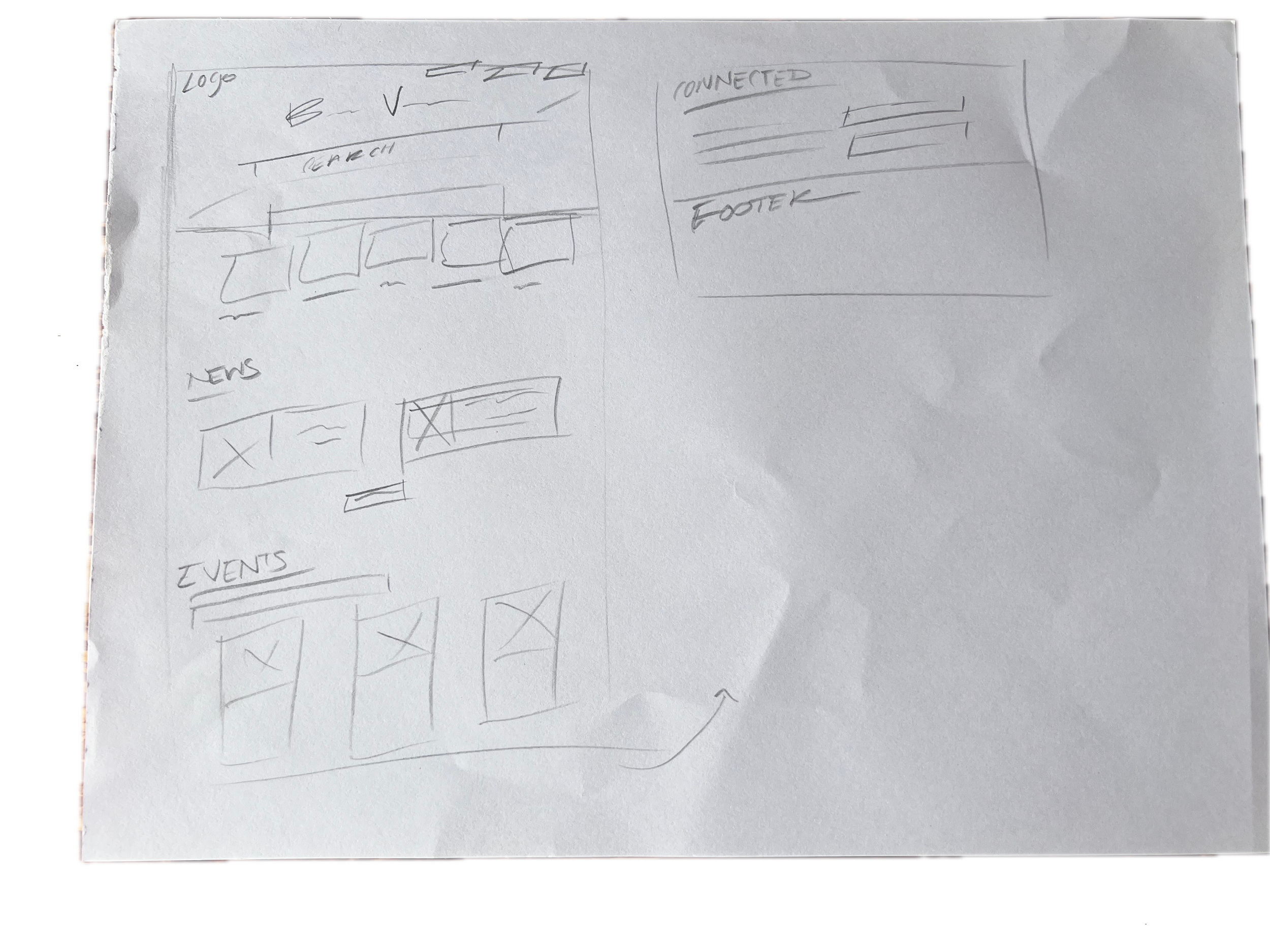
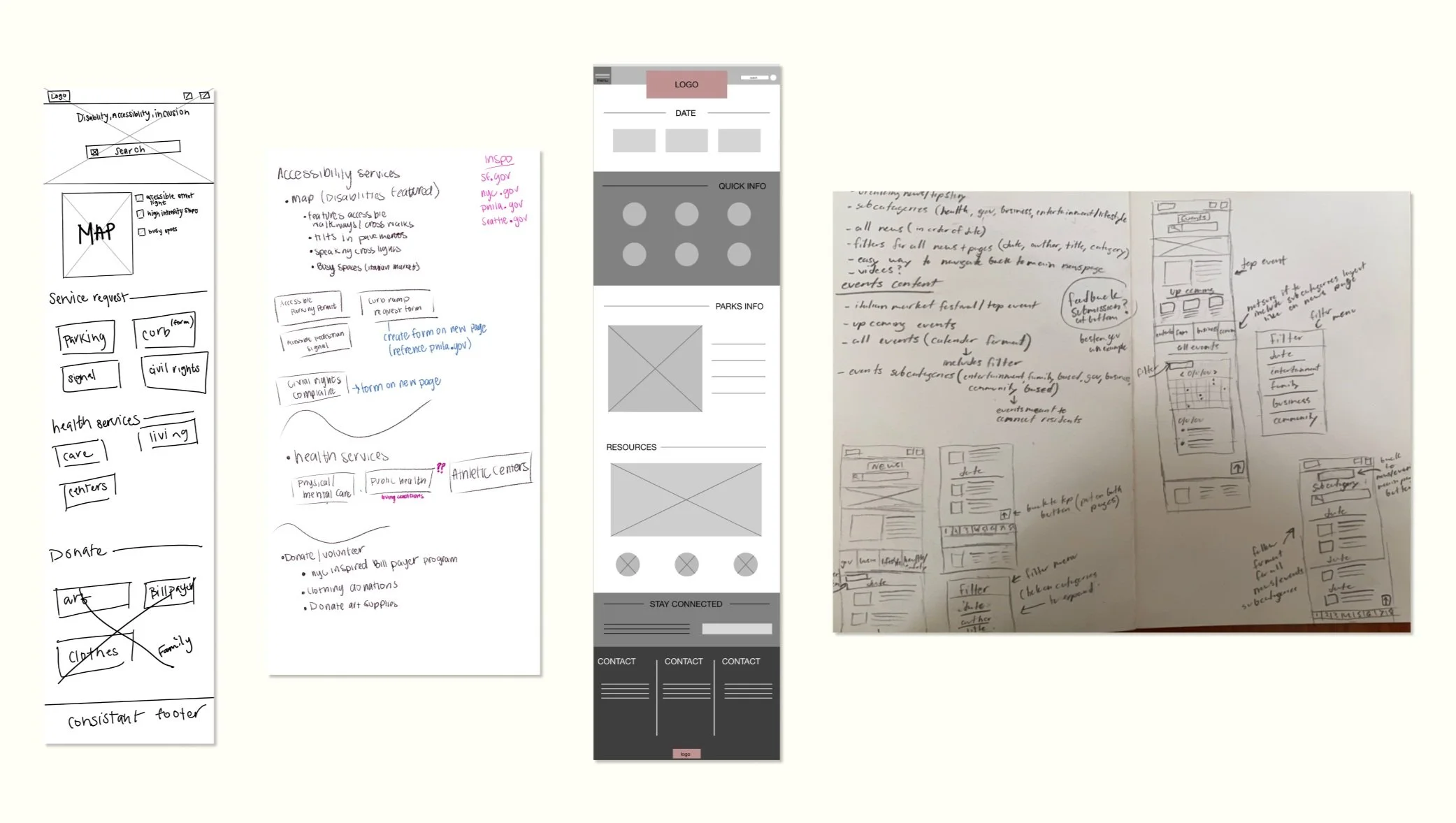
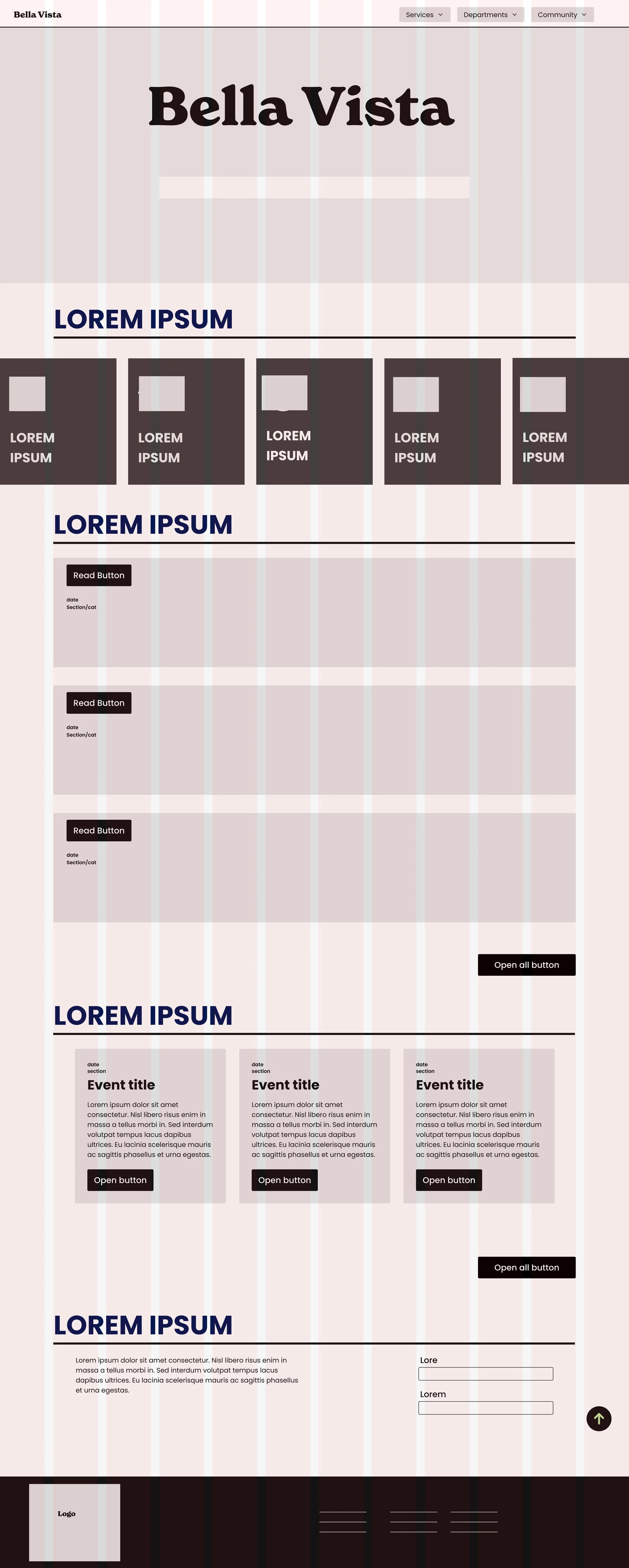
Paper
wireframes
First variations of prototypes- due this was a collaboration project we had a lot of different wireframing pages to work through.

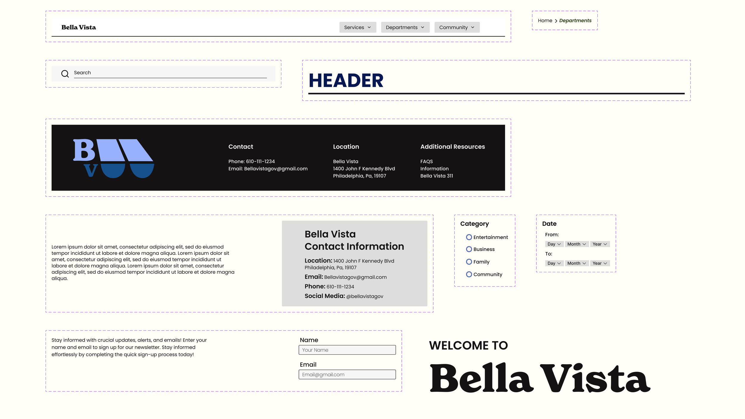
Design system
To maintain consistency and efficiency, I developed a design system rooted in an 8-pixel grid. This framework ensured that every element adhered to multiples of 8, providing a standardized approach across the entire design. For instance, items within the same category were spaced 40 pixels apart, headers were assigned 32 pixels, and sections were separated by 48 pixels.
Recognizing the importance of cohesion in a collaborative environment, I established clear guidelines that the team could easily follow. This design system not only streamlined our workflow but also reinforced a unified brand identity across all pages. With everyone on the same page, we minimized inconsistencies and ensured that our designs remained cohesive, regardless of who was contributing.
By centralizing design decisions and setting up rules early on, we could focus more on creativity and problem-solving while still adhering to a consistent structure that tied everything together.


Color palette


After agreeing on the primarily blue color palette, I conducted thorough testing to surpass minimum WCAG standards, ensuring comprehensive accessibility. Approvals from color blind tests not only validate adherence to guidelines but also attest to the palette's universal aesthetic appeal. My approach to this color palette prioritized inclusivity for users with color vision deficiencies but also resulted in an engaging designs.
Blue serves as the primary color in our palette, to meet people where they know in color theory. It is commonly associated with trust, intelligence, and reliability, all the stuff you’re looking for when accessing a government website. By leveraging the psychological implications of blue, we aimed to instill a sense of credibility and assurance, fostering user confidence.
Logo exploration
We took visual inspiration by what philadelphians think of when they think of Bella Vista— Italian Market vendor carts.

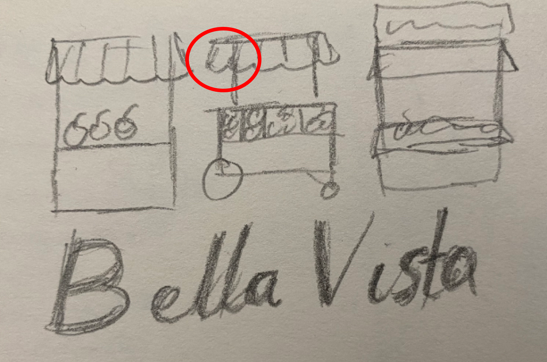

Final horizontal wordmark

Final submark


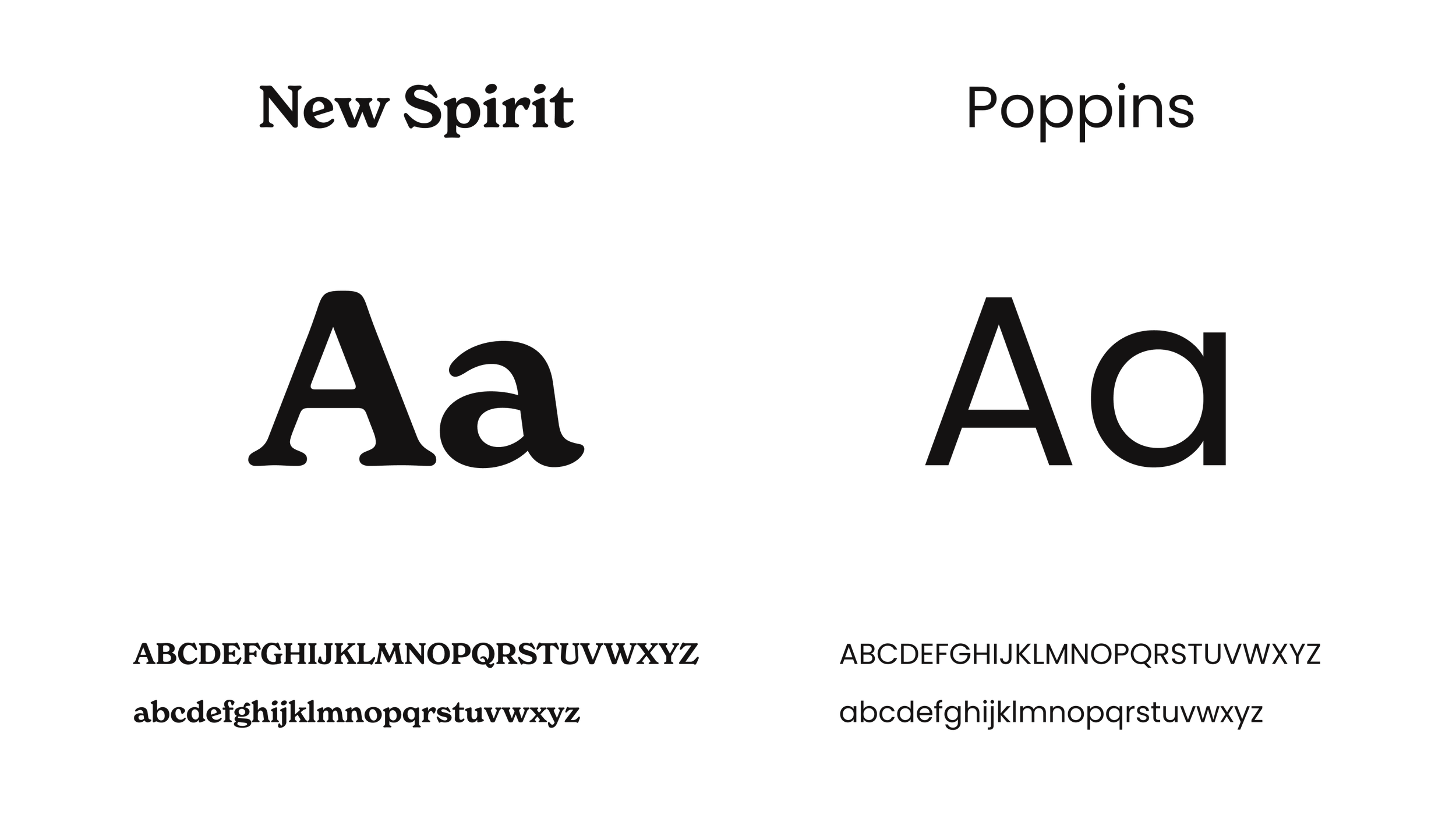
Typography

Molecular
design process
We started with designing icons, which felt like a good way to ease into the UI process without getting too attached to our initial decisions. This approach made me more comfortable and ready to design the larger components.
Once I finalized the designs for the components and their various states, the other designer transformed them into interactive elements.Since these components were used consistently across multiple pages, we placed and locked them in position, which streamlined the process and ensured a more cohesive experience throughout the project.

Our research on other government websites influenced the design of cards and hover states. I drew inspiration from how article titles on those sites became lighter when hovered over. For large-scale content buttons, I incorporated hover states that added subtle interactive elements to enhance the user experience.
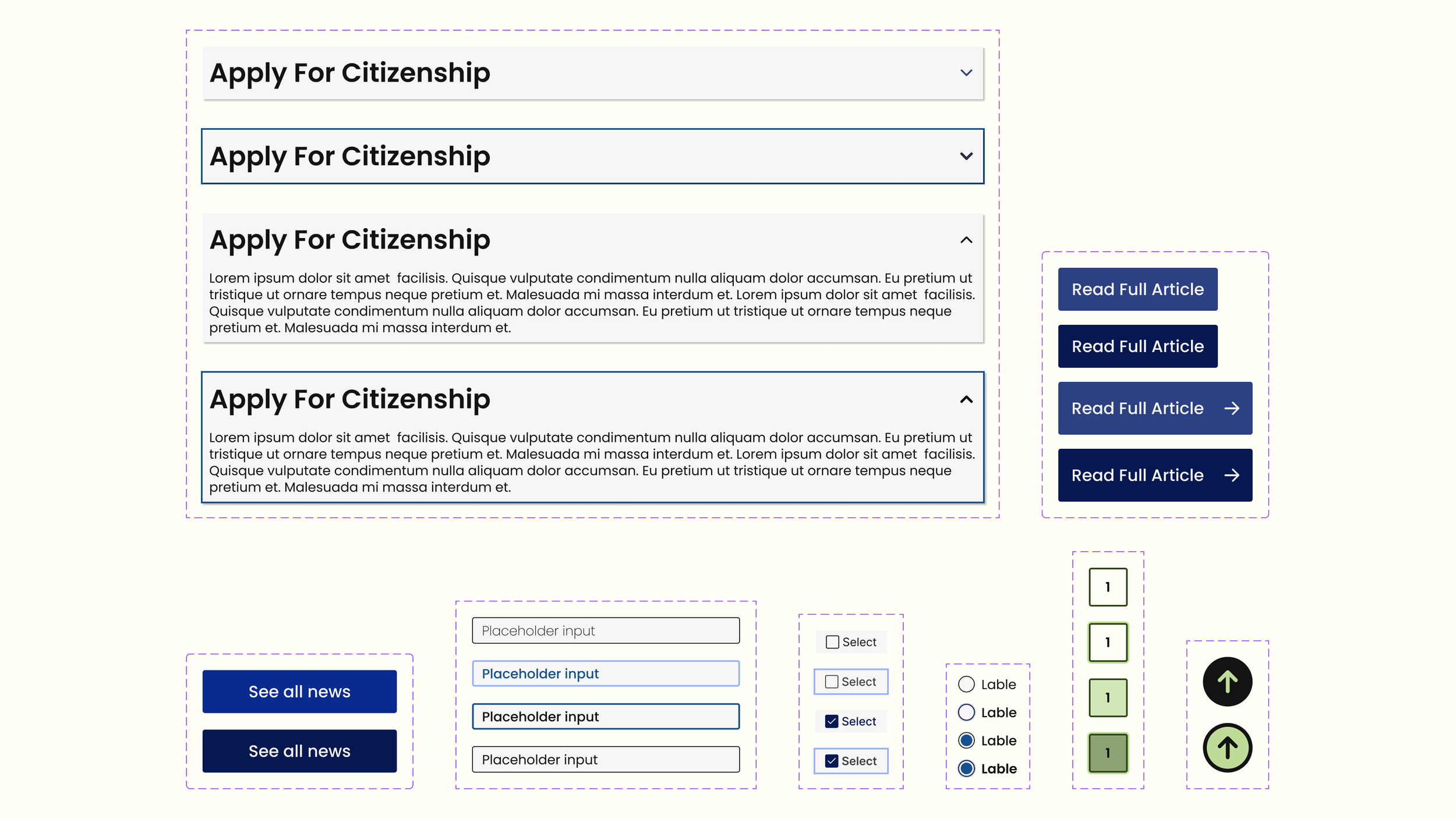
All primary buttons and their interactive states were intentionally designed slightly larger than average to accommodate users who might benefit from increased accessibility and ease of use.
Accessing
immigration services
Accessing events
Accessing news
Conclusion
Area’s of
improvement
This project provided valuable insights into designing for a diverse community with varying needs. By combining thorough research, thoughtful design systems, and consistent collaboration, I was able to create a user-friendly interface that prioritizes clarity and accessibility for everyone. From initial icon design to final component integration, each decision was made with the user in mind, resulting in a cohesive and functional design.
One area I would improve on is expanding user testing in the process. While we conducted thorough research, getting more direct feedback from real users—especially those in the vulnerable populations we were designing for—could have provided additional insights that might have further refined our designs and ensured we addressed any usability challenges before moving into development.


