


Project details:
15 weeks

Researcher &
Designer

Scott Laserow
Creative Director

Figma

Adobe
Creative Cloud
Google Scholar
The why?
The who?
While conducting research for a different project, I came across a Reddit thread where introverts expressed frustration with traditional dating apps. Many felt overwhelmed by the emphasis on extroverted, fast-paced interactions and a lack of spaces that cater to quieter personalities. Even though I’m not personally single therefore not active user of dating apps, I saw this as a unique opportunity to explore a real, user-centered problem.
This project allowed me to dive into authentic user pain points and practice UX design by creating solutions that could help introverts feel more comfortable in their dating experiences.
In is designed specifically for introverts, a group that often feels overlooked in the world of online dating. Unlike traditional dating apps that prioritize fast connections and quick swipes, introverts tend to seek more meaningful, slower-paced interactions. For many, the typical dating app experience feels overwhelming, making it difficult to forge genuine connections.
Introverts are typically drawn to environments where they can feel at ease, have deeper conversations, and gradually get to know others without pressure. This app seeks to create a space that respects and supports this need, providing a comfortable platform that allows introverts to connect in a way that feels natural to them.
User research
Google forms survey

To gather accurate insights into what users, whether introverted or not, seek in dating apps, my initial step was to create a survey. I collected feedback from 23 people representing diverse ages, sexual orientations, and preferences.


With the insights I've gathered from users about their dating app experiences, my next step was to examine the current market. This highlighted how In app can better meet the needs of introverts and stand out from the competition.
Competitors:

-
Most respondents prefer to transition within 1 week.
Some prefer 1-2 weeks, citing the importance of establishing a connection.
A few indicated 3-4 days for initial conversations before meeting.
Several expressed a desire to meet quickly to gauge compatibility.
-
Weekly at #1
Daily at #2
Monthly at #3
Multiple times a day at #4
-
Users appreciate the opportunity to meet a variety of people and match based on shared interests and proximity.
Fun prompts, questionnaires (like those on Hinge), and the ability to link music tastes enhance user experience.
Many find the interfaces easy to navigate and enjoy features that foster virtual socializing.Users value platforms that allow for meaningful interactions beyond just photos, helping to avoid shallow connections.
Users value platforms that allow for meaningful interactions beyond just photos, helping to avoid shallow connections.
-
Particularly for marginalized groups (e.g., trans individuals), options can feel scarce and overly focused on physical attractiveness.
Users express frustration with matching profiles that seem innocent but lead to inappropriate behavior; a filter for relationship intent (casual vs. serious) is suggested.
The emphasis on photo-heavy profiles leads to shallow conversations and relationships, fostering a toxic hookup culture.
The swipe mechanism prioritizes quick decisions over meaningful connections, making it feel like a game rather than a genuine dating experience.
Conversations can become repetitive or stale, often due to a lack of shared interests or investment in getting to know each other.


Design process
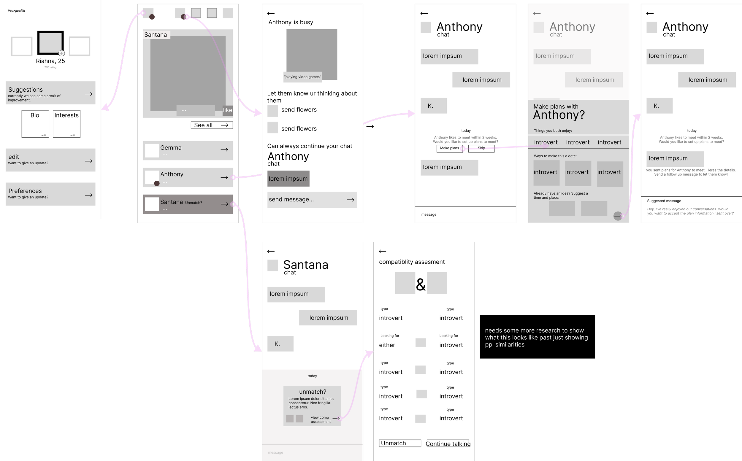
original site maps

To start the design process, I defined the core problem: most dating apps promote fast-paced, surface-level interactions, which often overwhelm introverts and lack opportunities for meaningful connections. From my survey and competitor analysis, I found that many users were frustrated by the superficial focus on photos, wishing instead for prompts that revealed shared interests or deeper insights. Respondents also expressed a desire for clarity in dating intentions—whether users were seeking casual or serious connections.
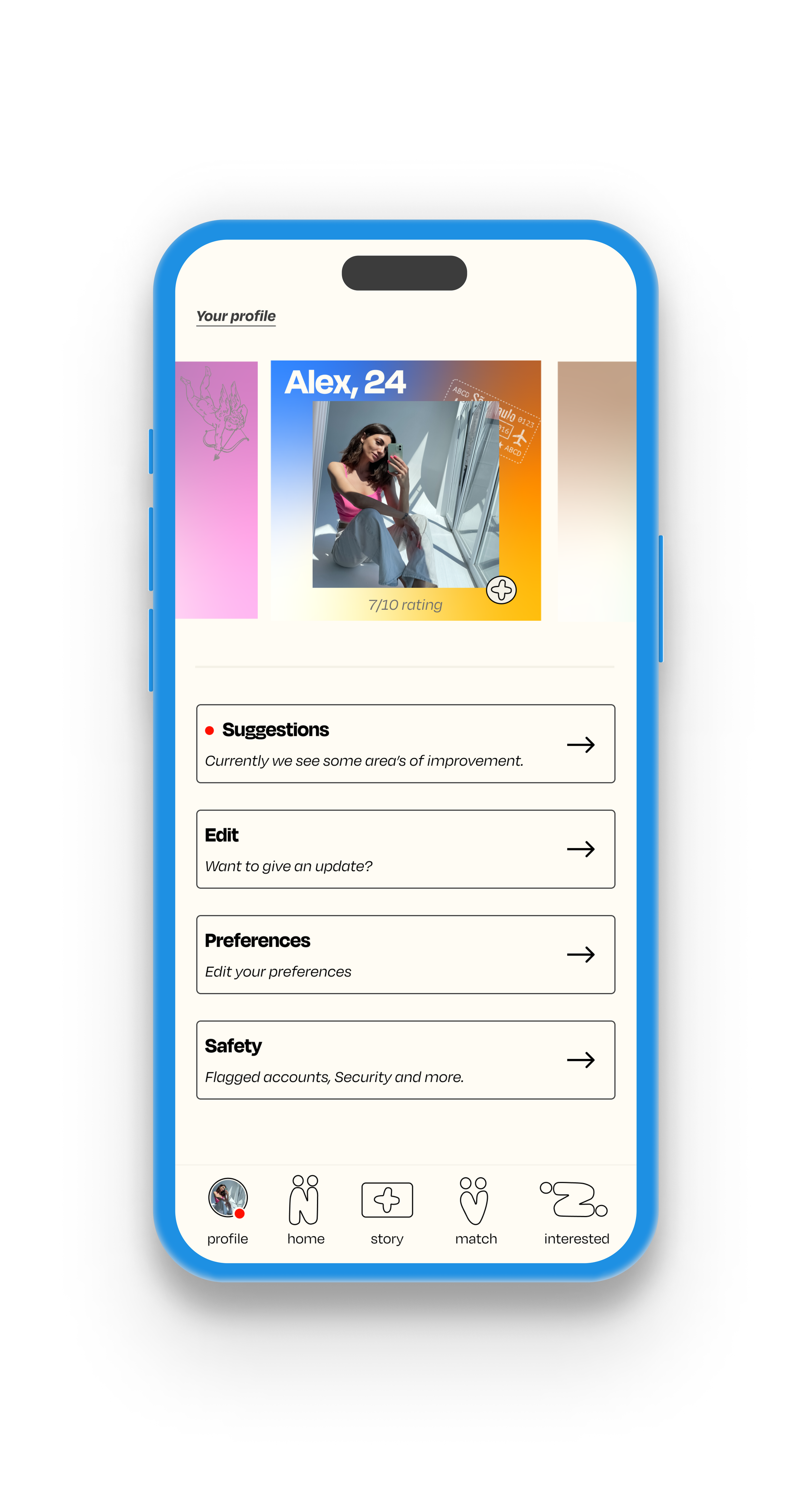
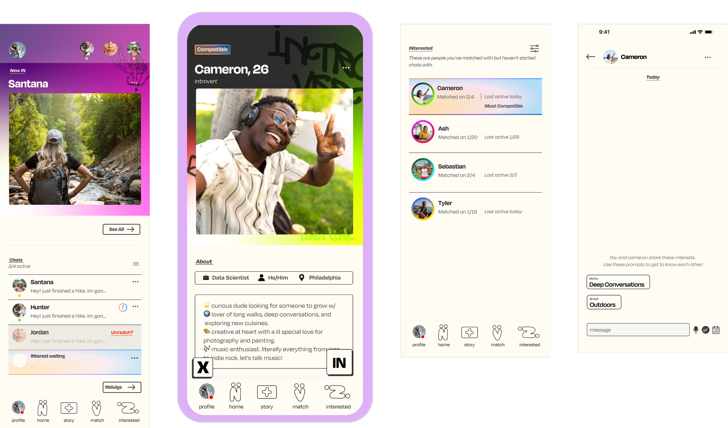
My goal became clear: to create a platform that prioritized meaningful connections while feeling calm and welcoming for introverts. I introduced a unique feature that limits users to a set number of active chats, meaning that new matches only become available when an existing chat concludes. This approach encourages intentional interactions and reduces the "swipe fatigue" common on other platforms. To enhance personalization, I also included customizable profile themes, letting users showcase their personality in a way that feels authentic and approachable, giving potential matches an immediate glimpse into who they are.


Wire frames
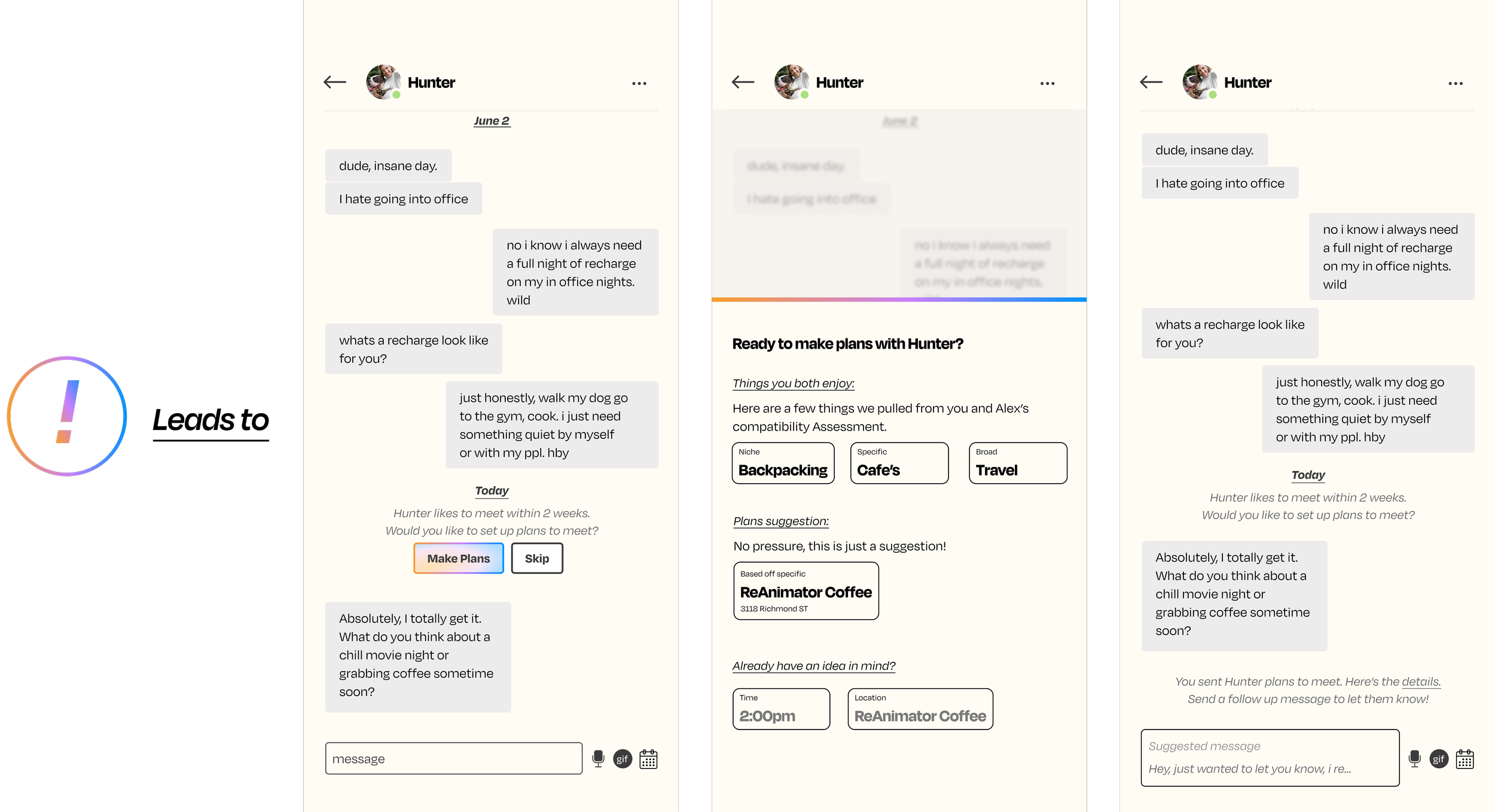
To enhance user experience, I designed the home screen to prioritize established chats rather than promoting the gamification of dating. My survey revealed that users appreciated the flexibility of meeting within various time frames, so I incorporated a feature that suggests transitioning off the app to arrange dates based on each match's preferred timing. This feature also helps users discover local activities tailored to their interests and hobbies, making it easier to find common ground for an enjoyable date. By facilitating these deeper connections, the app empowers users to take the next step in their dating journey on their own terms.

Design system
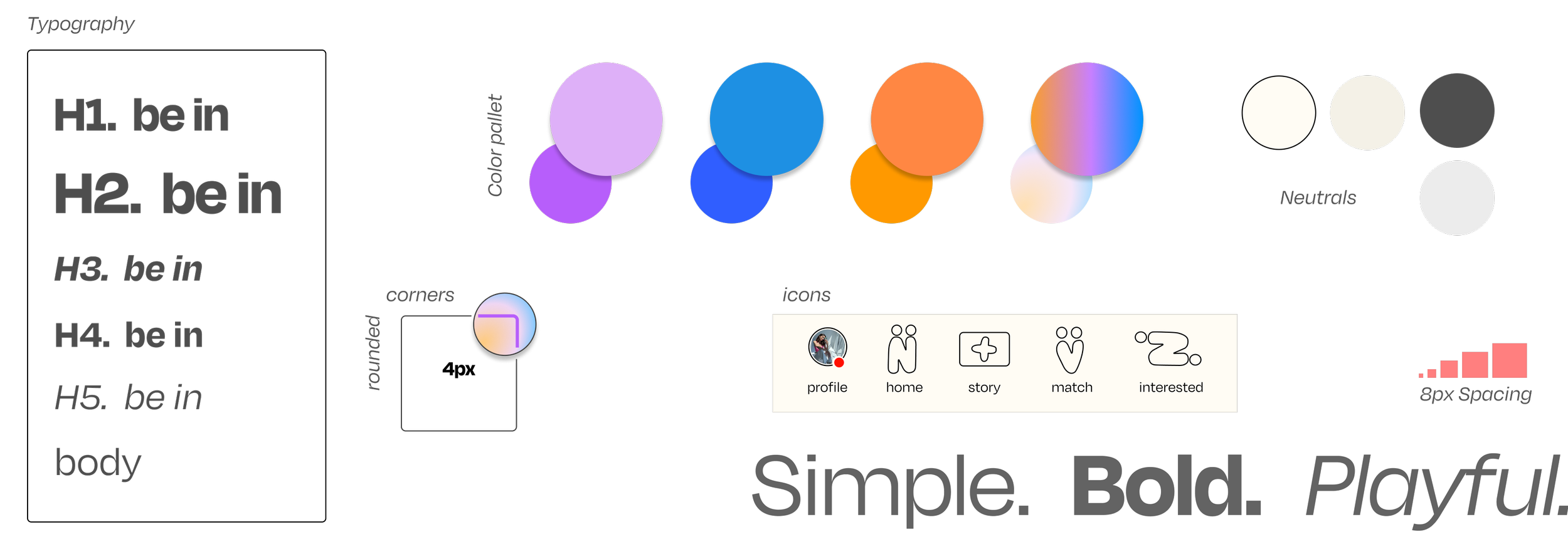
To create a cohesive and calming experience, I developed a design system that guides the visual style and interaction patterns of the app. My goal was to create a lively yet calming energy with subtle pops of color that felt natural rather than overwhelming. To achieve this, I chose a slightly off-white background for a softer visual experience and an off-black for text and buttons, adding a gentle contrast. I used color thoughtfully as playful accents throughout the design, giving the In a hint of personality without overpowering the overall feel.
Profile themes
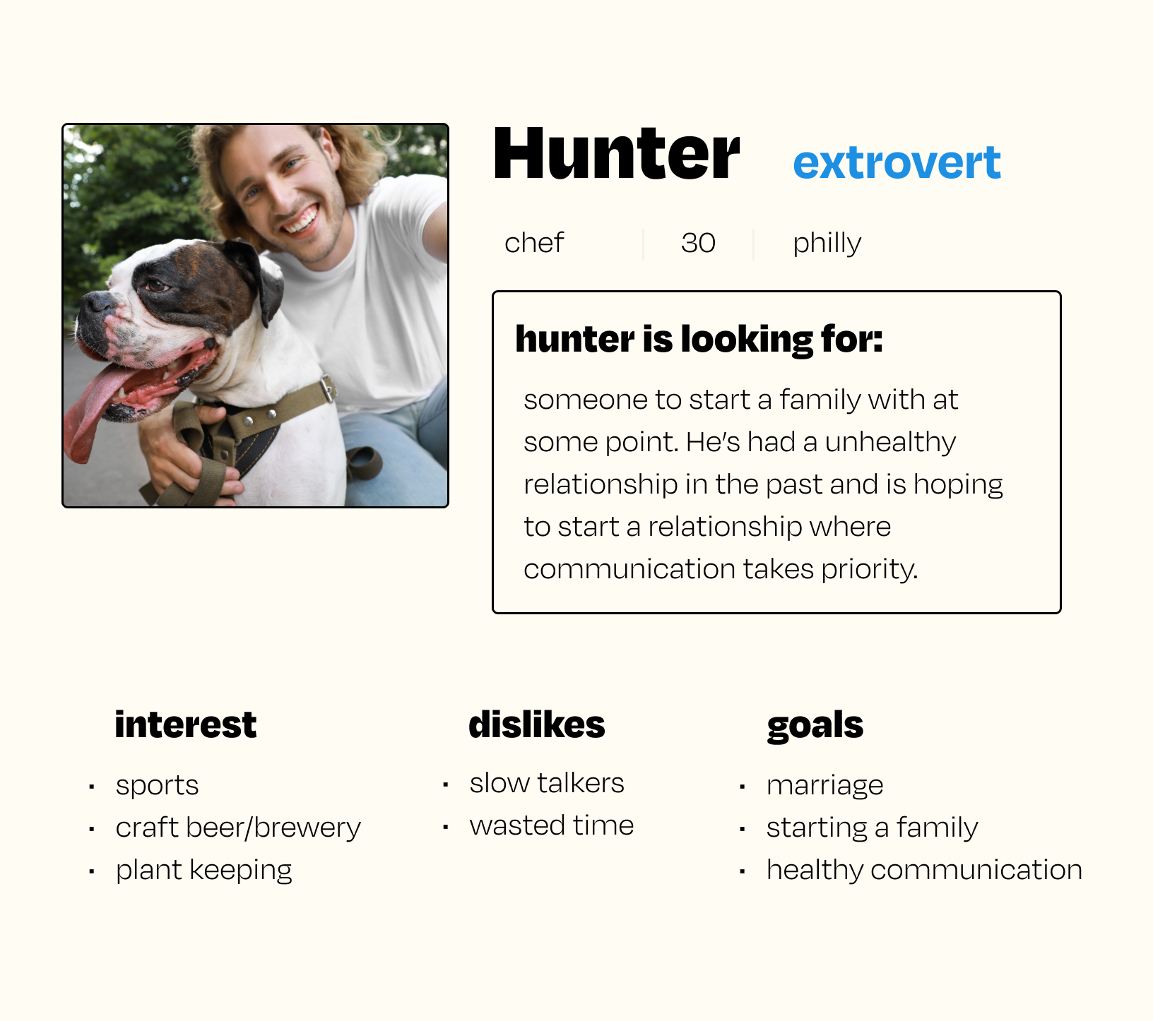
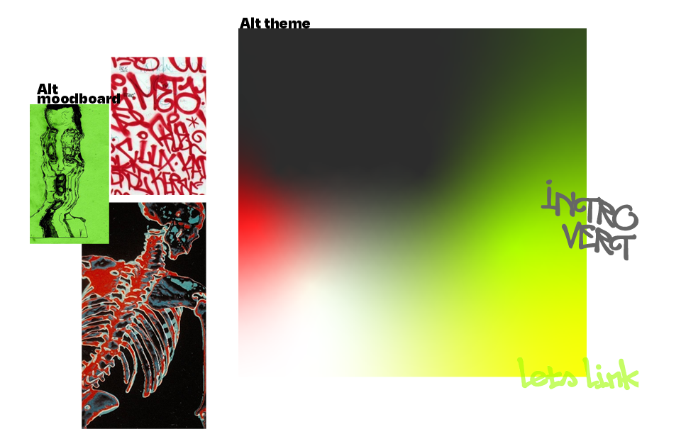
To further personalize the In experience, I incorporated customizable profile themes. This feature allows users to select from a range of theme options, each with a unique color scheme and style, adding a touch of individuality to their profiles. These themes provide a subtle yet meaningful way for users to express themselves and set the tone for their interactions. The themes, along with the thoughtfully chosen colors, foster an inviting atmosphere, encouraging users to showcase who they are at a glance. Each theme is inspired by a lifestyle or interest. Below is the moodboards and final themes for romantic and alt themes.

Matching & chatting
Making plans

Conclusion
Designing a dating app for introverts gave me the opportunity to address a unique, often-overlooked user base within the dating space. By focusing on intentional interactions and creating a calming, supportive environment, I aimed to redefine what a dating app experience could feel like for quieter personalities. Through features like limited chats, personalized profile themes, and guided suggestions for dates, this app encourages users to make authentic connections on their terms.
Throughout this project, I refined my skills in user-centered design, integrating user insights at every stage to ensure the experience felt natural and welcoming. This case study highlights the potential of thoughtful design to meet specific user needs, and it deepened my commitment to creating inclusive, impactful products that prioritize user comfort and connection.