

Project 1:
the trailhead
Deliverables:
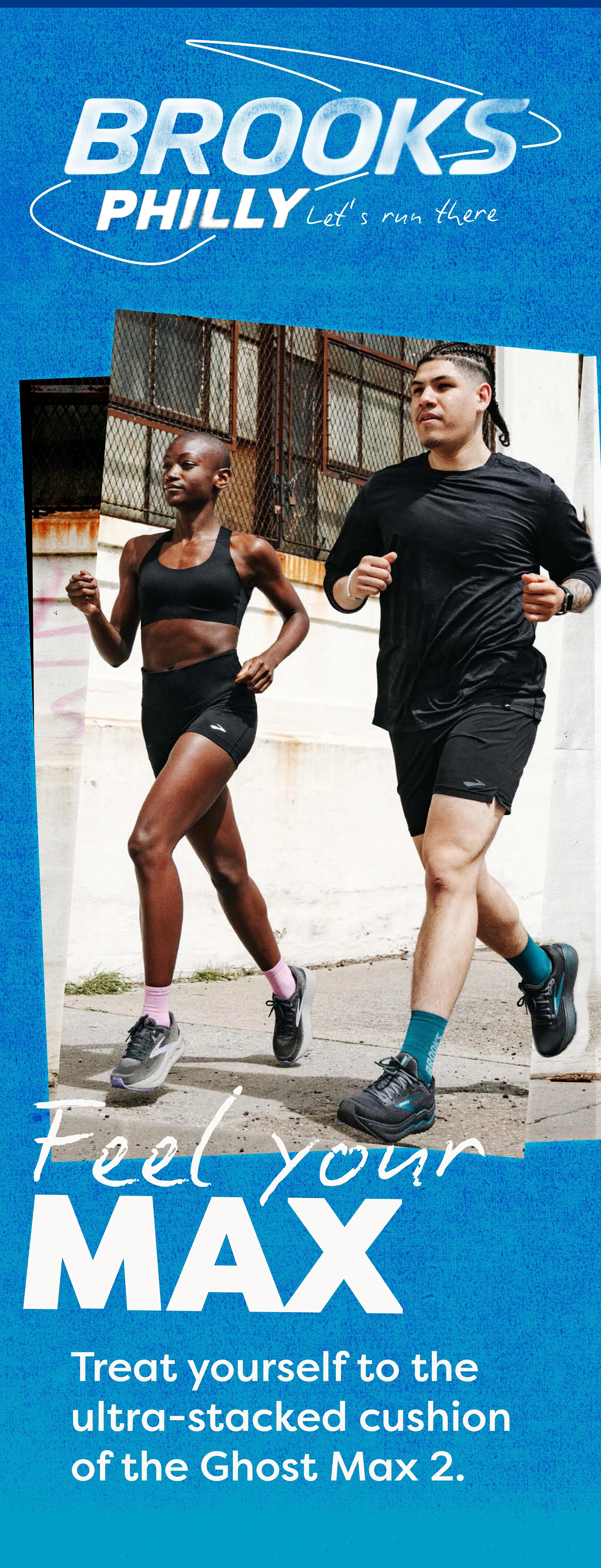
• F24 Hyperion Max 2 & Ghost Max 2 launch promotion
• Stoneway and 34th street windows
• Interior pillar wrap
• Spec sheets for each shoe
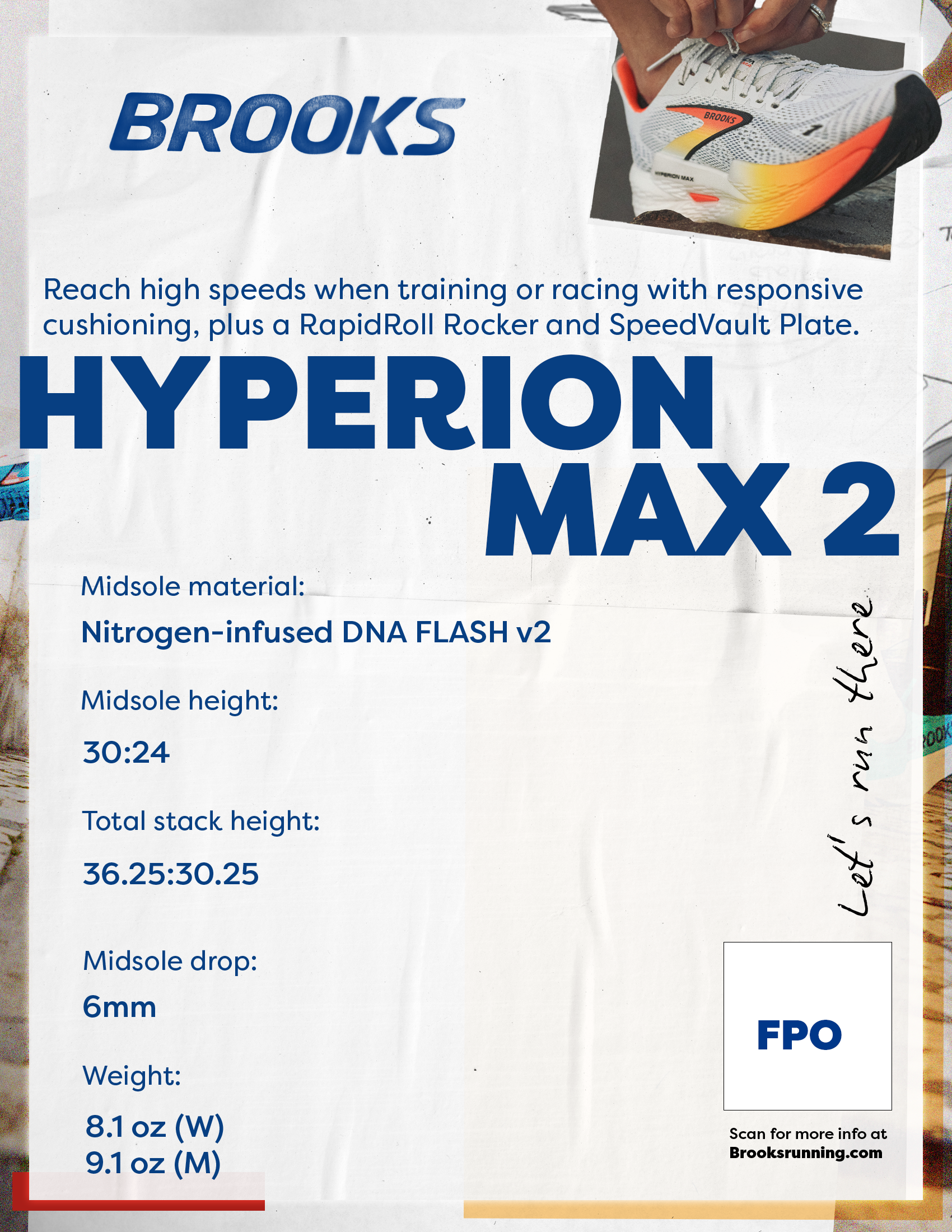
• Shoe display specs
windows
34th street
Stoneway
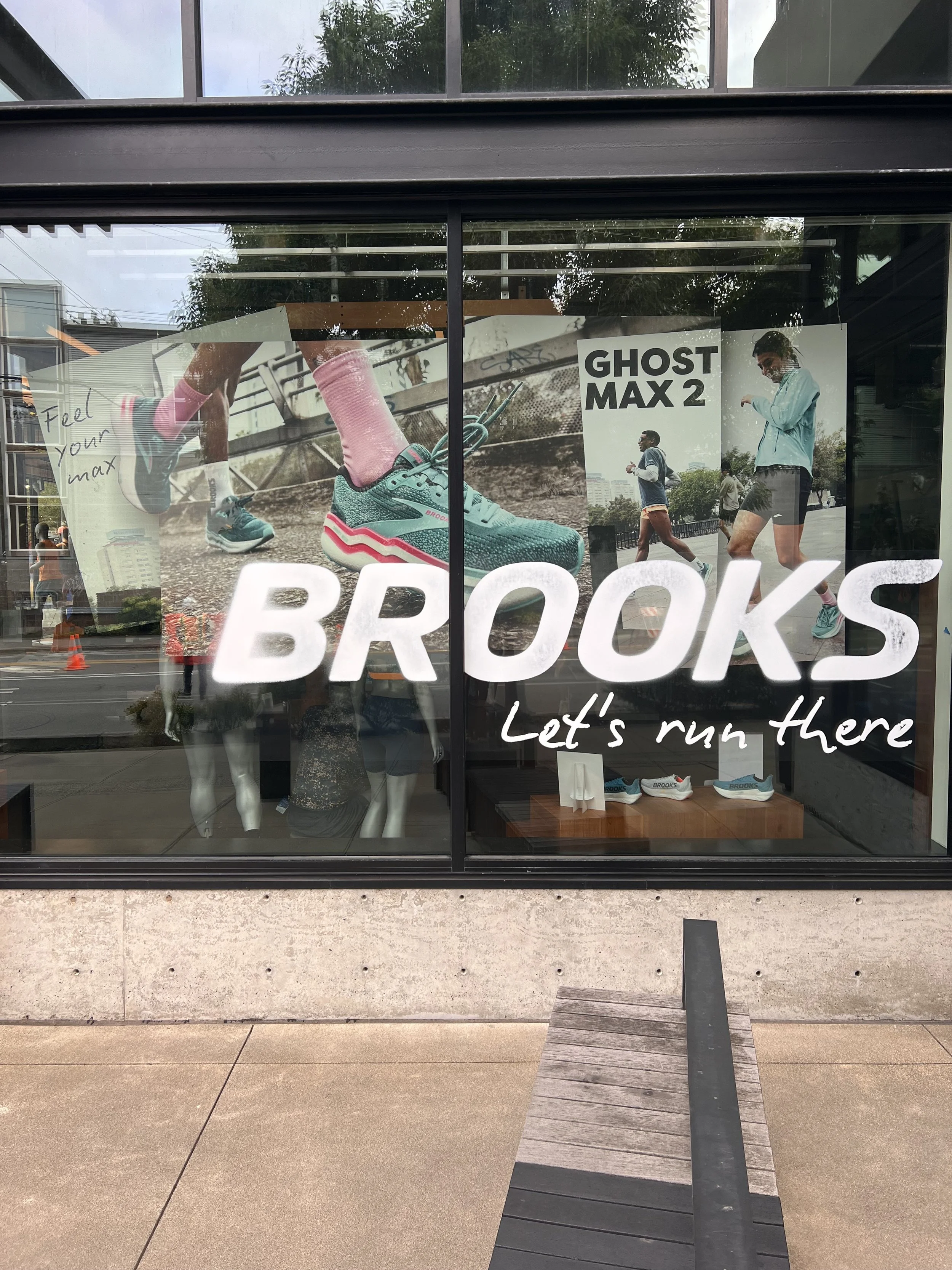

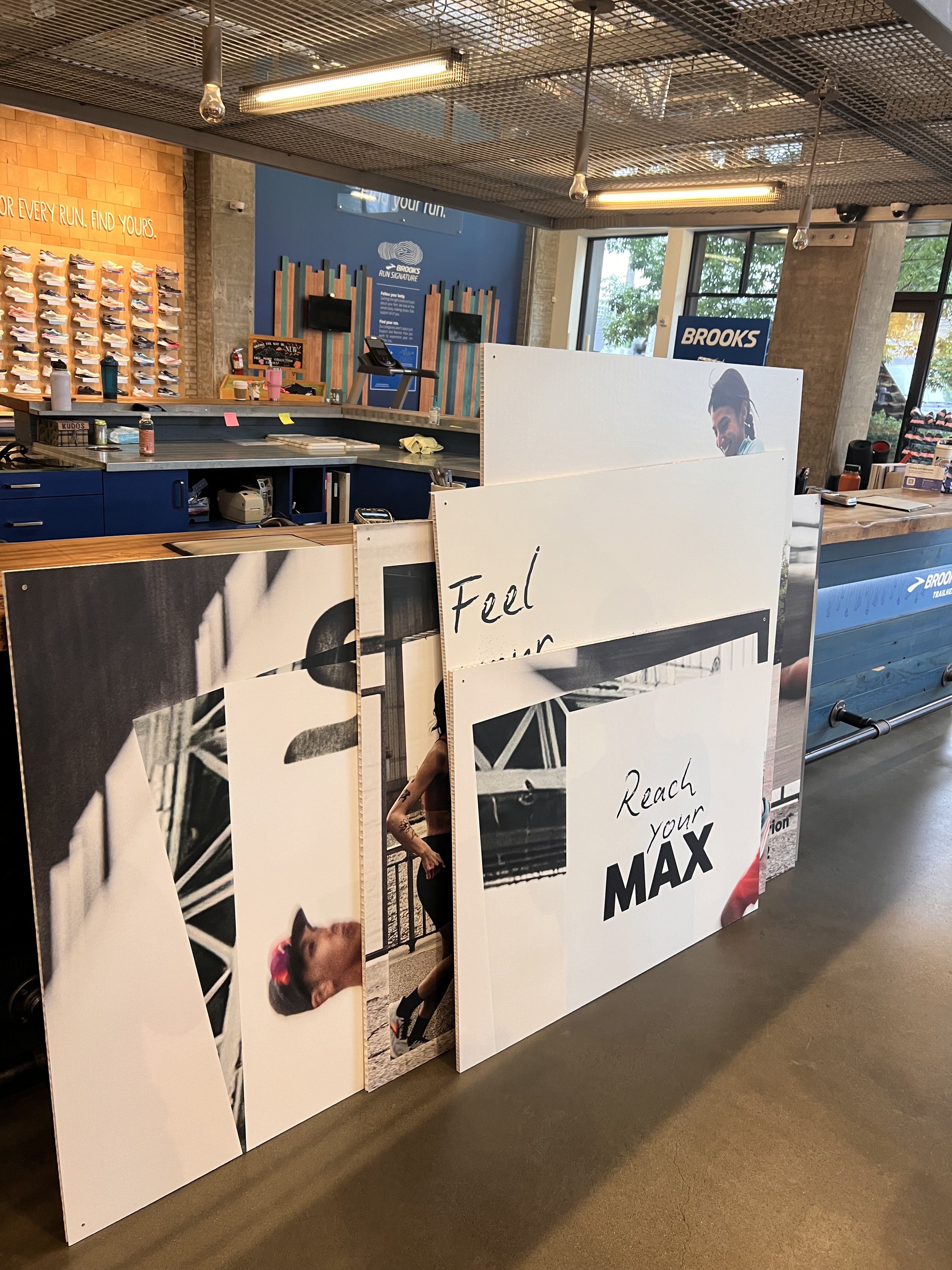
The exterior window display on 34th Street was designed to promote the Ghost Max 2. The design spanned across three tilted and layered boards, adding depth and visual interest to the layout. This approach also allowed me to break away from the typical flat, horizontal layout and create something more engaging. My favorite part of the design was the large die-cut of the shoe on the middle board. This was a new approach for Brooks and it turned out to be a huge success.


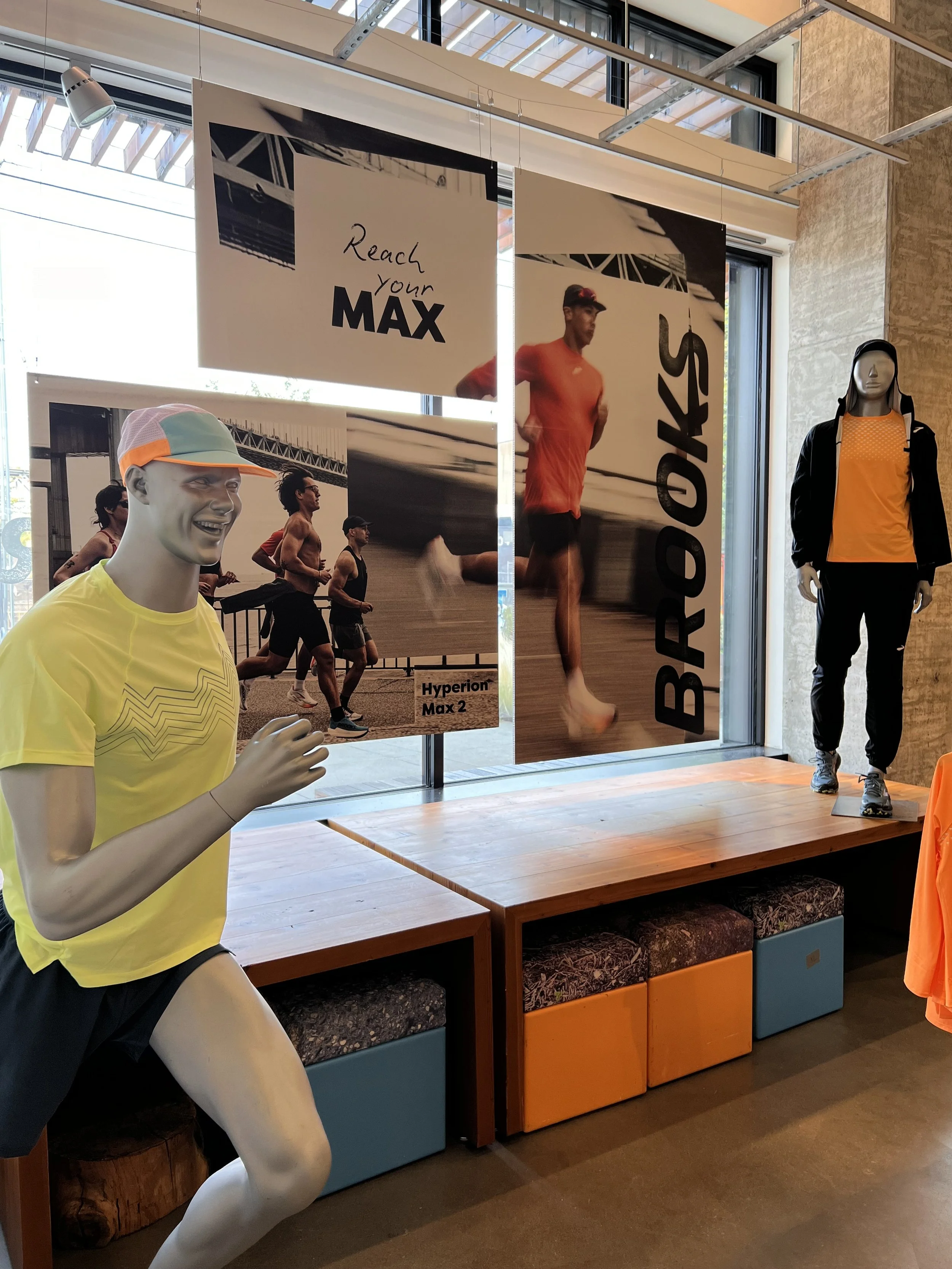
This design is on the interior 34th st window of the store, the brief called for integrating the stories of the Ghost Max 2 and Hyperion Max 2 into a unified layout. This was a considerable challenge, given the contrasting narratives and unique production shoots for each shoe.


Both the interior and exterior designs for the Stoneway windows were centered around the story of the Hyperion Max 2 shoe. In contrast to the 34th Street windows, this design featured three boards with spacing between them. Instead of incorporating overlapping as part of the design, this window maintained its flow across the boards, despite their varying sizes.

signage

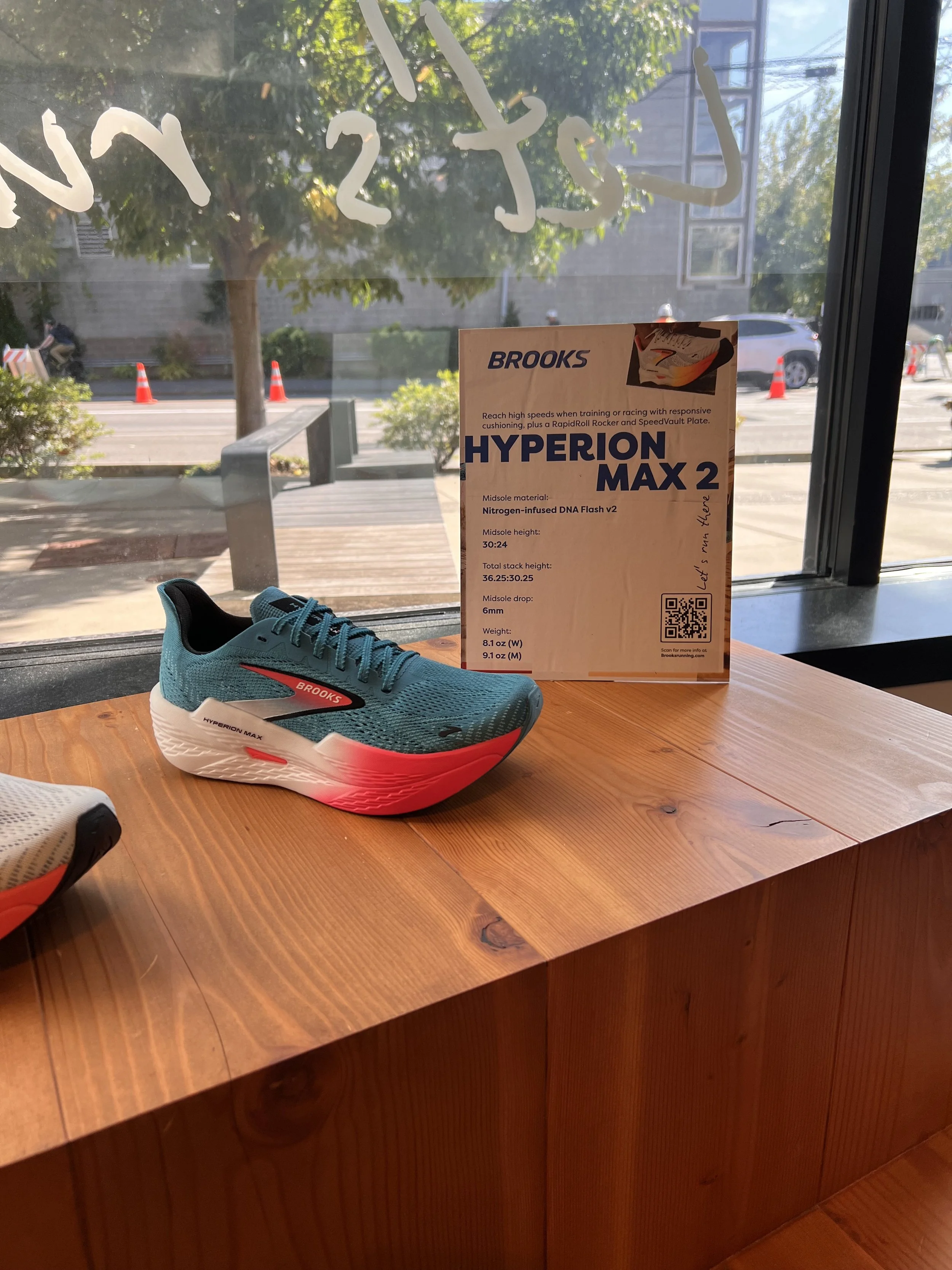
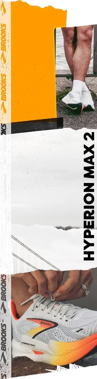
The interior signage I designed is displayed next to the shoes to help customers identify which shoe best suits their needs and make confident purchase decisions. While maintaining a consistent design style, I adjusted the color palette to align with the creative guidelines for each shoe. The tagline "What's your Max?", developed by the copywriter, was prominently placed on the shoe wall to create an engaging and energetic vibe. This complemented the detailed spec sheets placed elsewhere in the store, offering customers both inspiration and in-depth product information.


pillars


Feeling inspired and driven to explore new ways to utilize the brand guidelines, I implemented a fresh approach for the interior pillars. Moving beyond the previous strategy of large blue floods and white typography, I introduced torn edges and embraced the raw concrete structure as an intentional design element. This innovative interpretation pushed the boundaries of the guidelines and received enthusiastic feedback from the team, opening new possibilities for future branding applications.
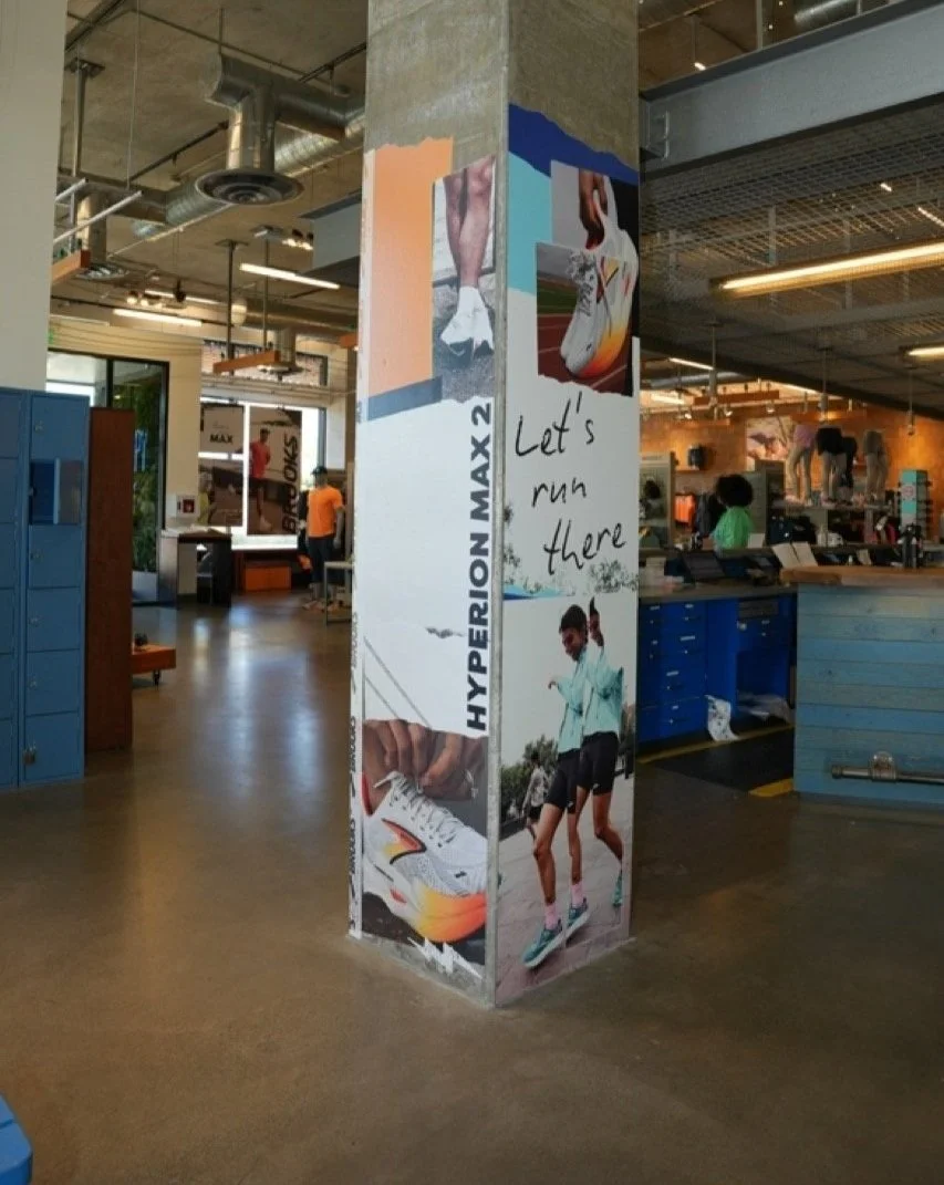
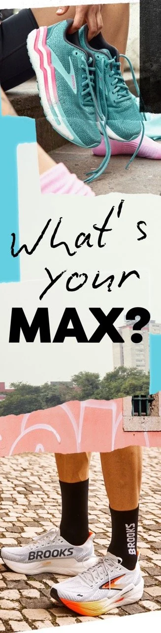
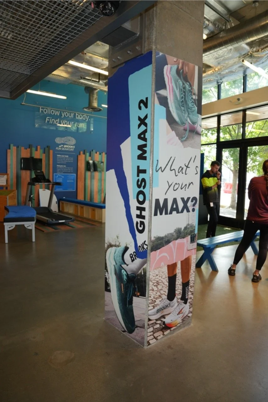
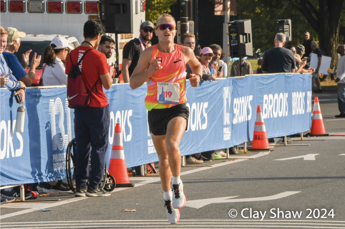
Image by Clay Shaw
Project 2:
Philadelphia
Distance Run
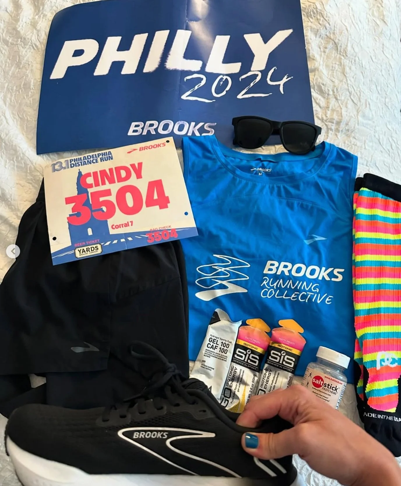
Deliverables:
• Consistent brand message for new Let’s Run There
• PDRxBrooks logo
• Cheer cards
• Pull-up banner for directional signage
• Pull-up with Ghost Max 2 imagery
• A-frame with directional signage
• Table talker and poster
PDRXBrooks
Experimentation phase:

Final logos

I was tasked with including the Brooks wordmark, the Brooks logo, the "Let's Run There" wordmark, and the city "Philadelphia" in the logo design. I explored several concepts, focusing on typography due to the heavy copy. Initially, I used the two fonts in the new branding, but I saw an opportunity to push the design further by incorporating the texture from the Brooks wordmark.
Inspired by this texture and the city's hustle and motion, I created a new texture for the "Philly" wordmark. My team responded well and requested I combine all three logos into one final mark.


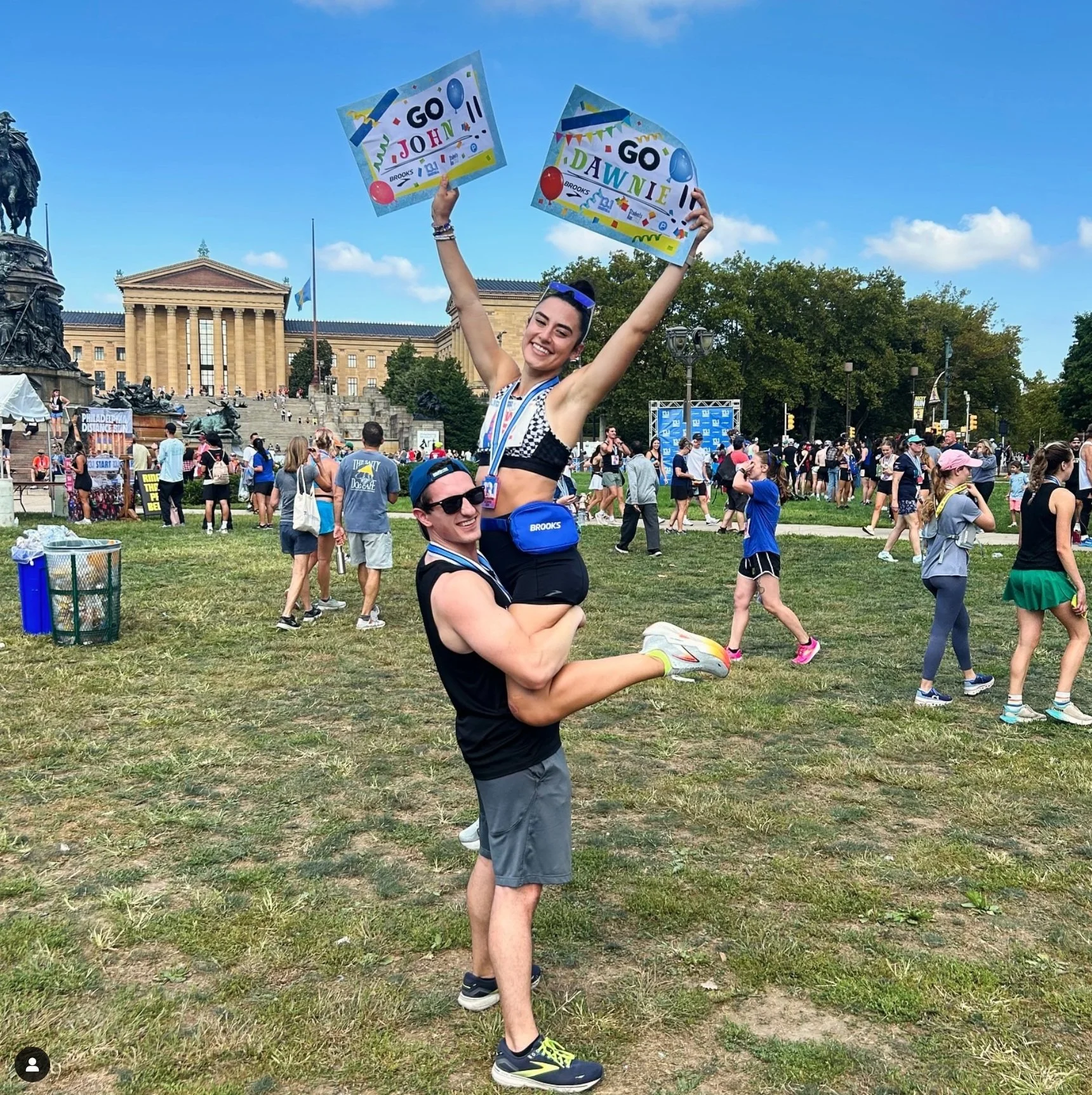
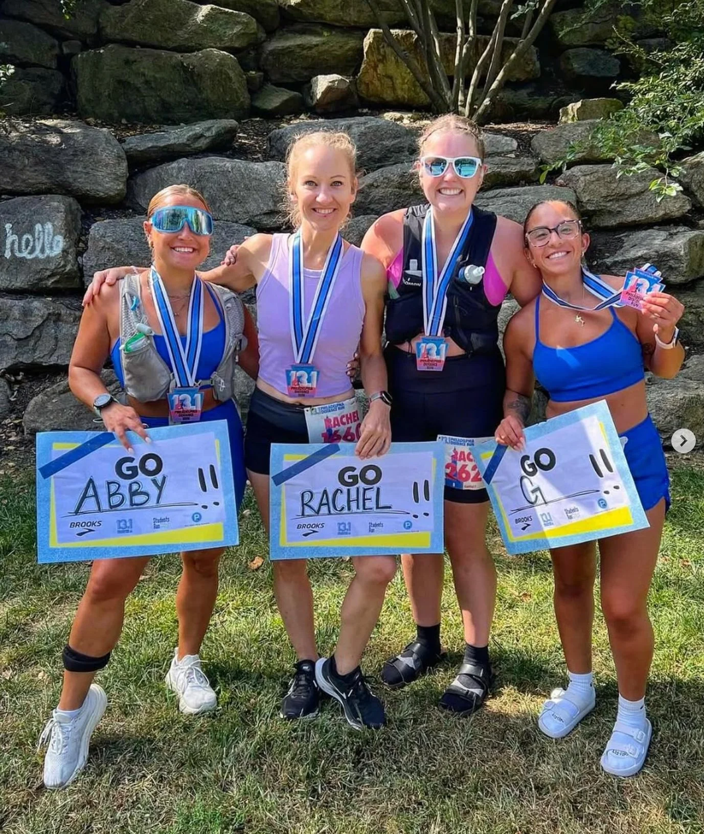
cheer cards

Side 1
In situation
Cheering from the crowd is an essential part of running and race day culture, with many spectators holding signs to support their runners. I designed these cheer cards to allow audience members to personalize them with their runner's name while promoting Brooks.
I continued the grunge/gritty texture I created with the logo into other aspects of this project. Philly wordmark has an element of movement or rough-ness. same with the side of the card audience members write the runners name, the “go” almost feels more ink like, tying back to the new brand expression that includes ink or handmade elements while maintaining this city like feel i’ve experimented with for this project.


Side 2
pull up banners

Directional PUBS
Promotional PUBS
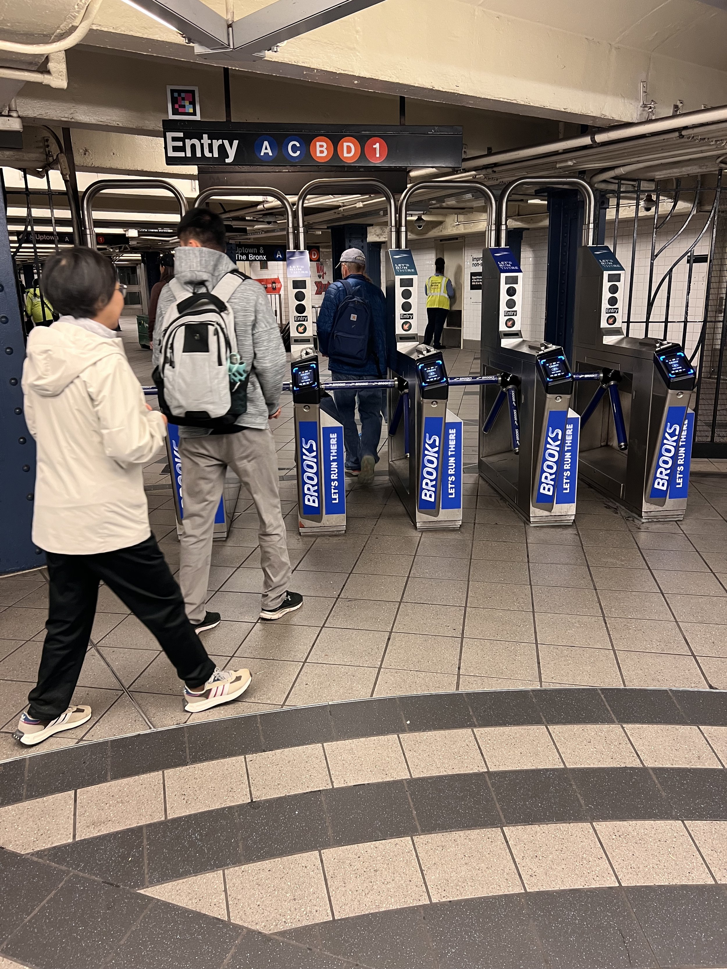
Project 3:
New York
Marathon
Deliverables:
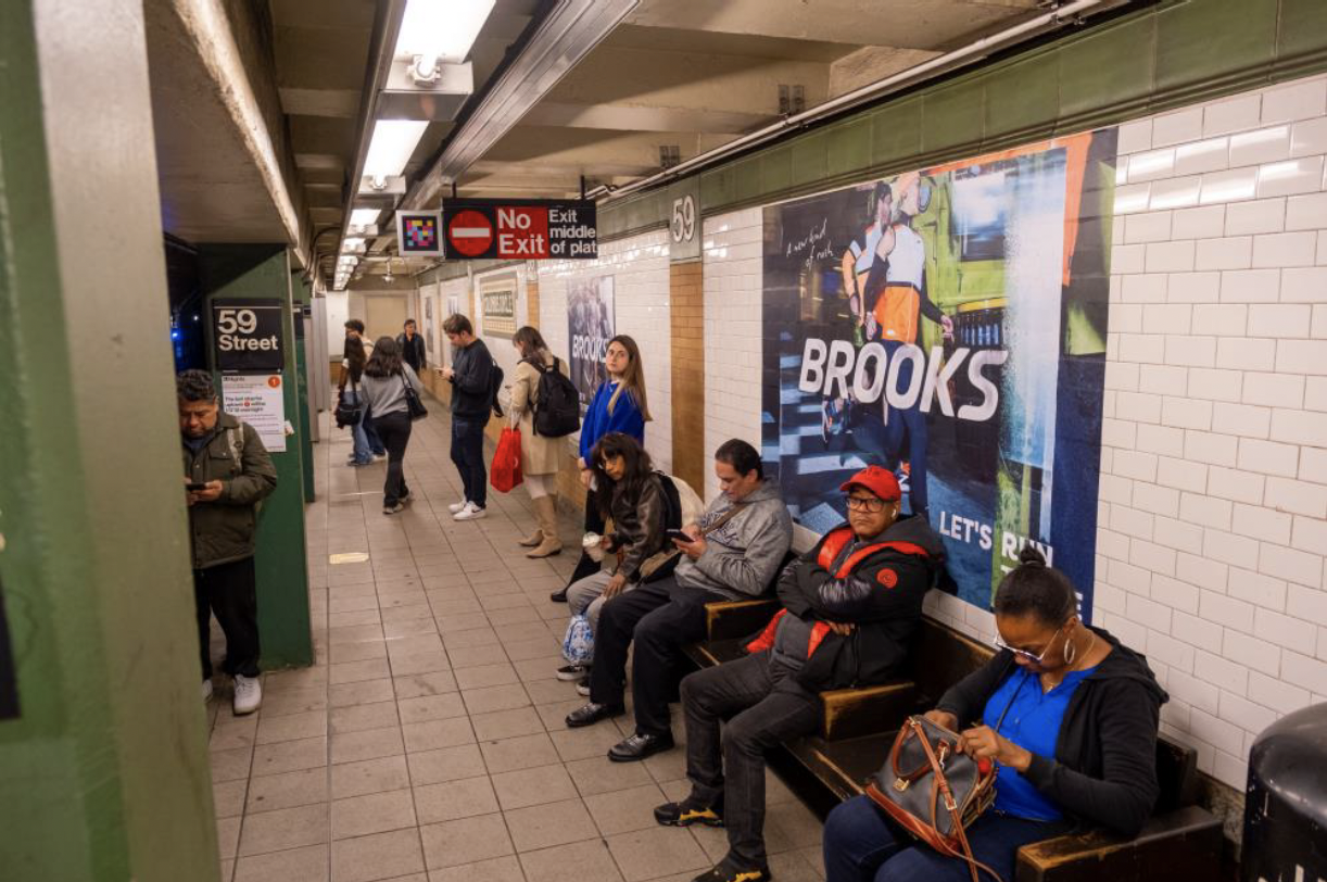
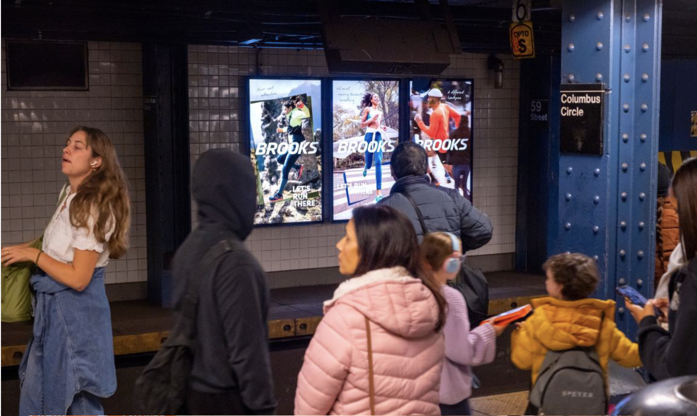
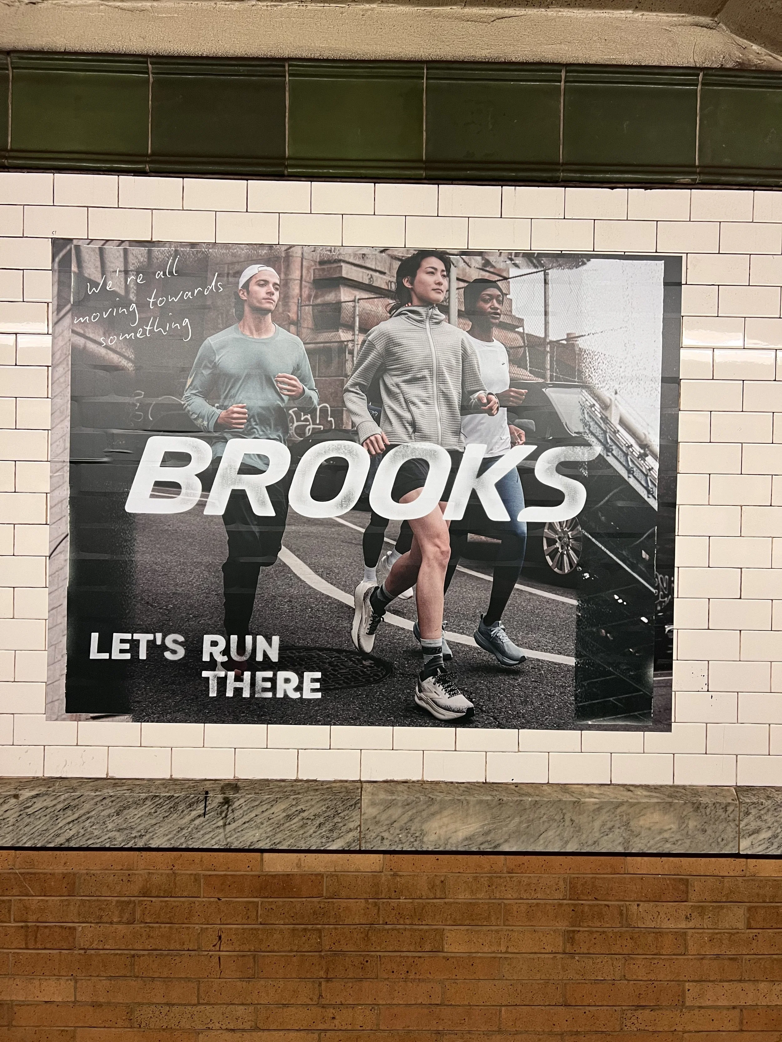
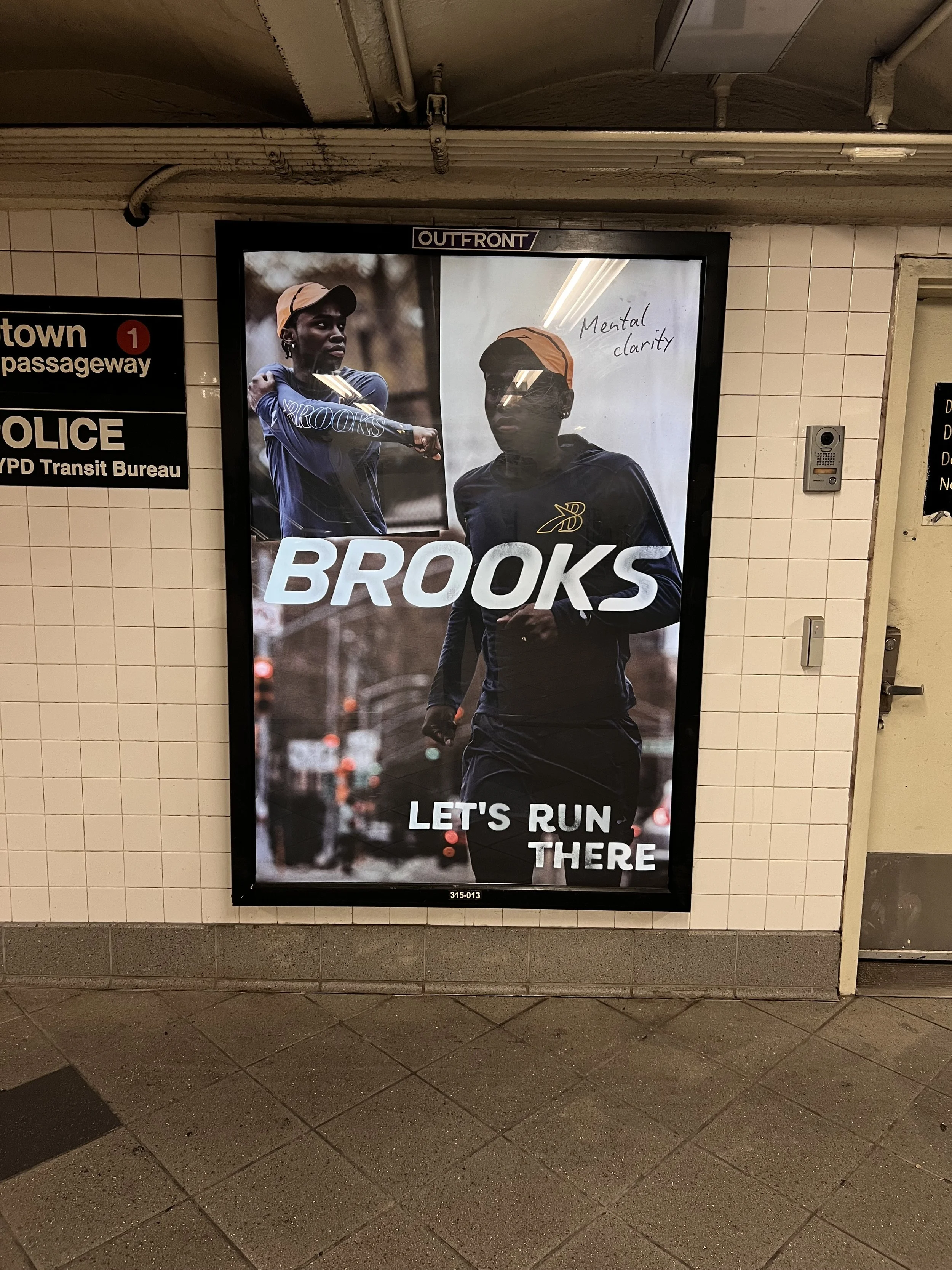
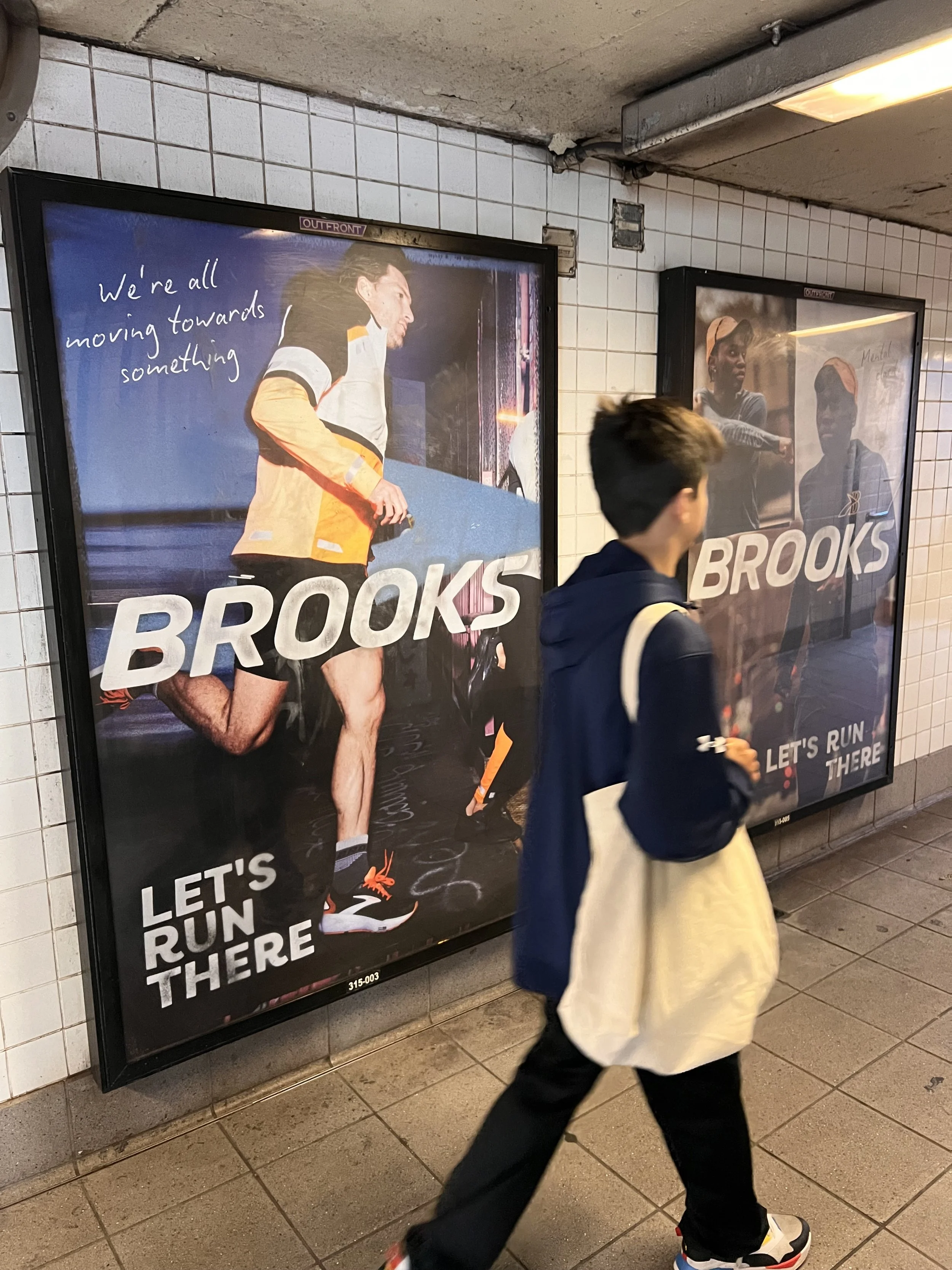
• Station takeover at the finishing line of one of the Abbott World Marathon Majors: New York Marathon
• Combination of backlit, video, static print and bus shelters
• Varying signage promoting and portraying the energy of the Brooks Running and runners
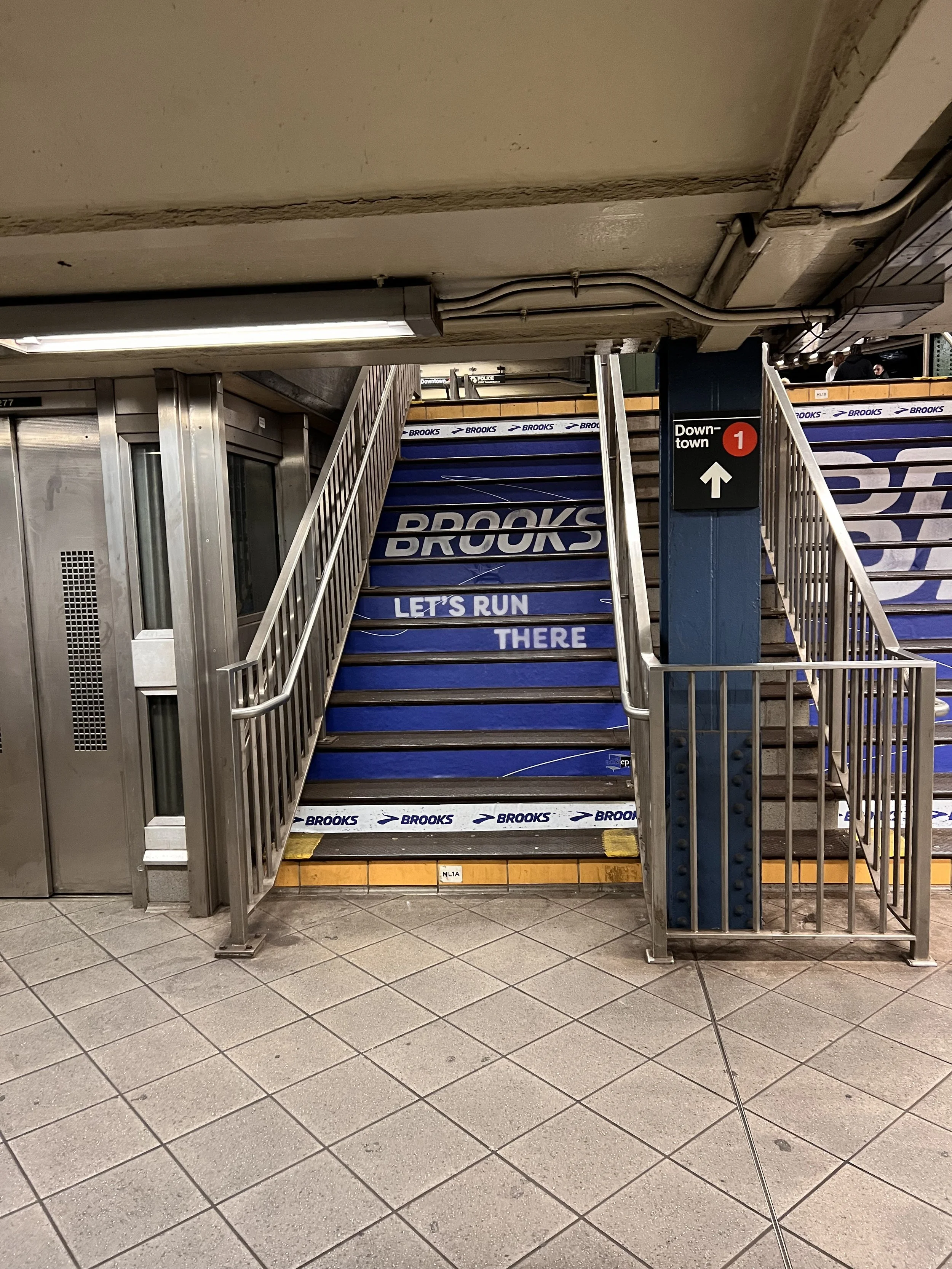
• Staircase flood with Brooks branding
• Reached a cumulative total 11,252,111 impressions


Final Thoughts:
Leaving was HARD
During my time at Brooks, I got to dive deep into branding, layout, and print design—working on everything from window signage to event branding and creative guidelines for new shoe launches. As someone who loves sports and movement, it was so cool to design for a brand that’s all about the running community. I also got to experiment with different design approaches, pushing creative boundaries while keeping everything on-brand.
A moment that will always stick with me was when my manager said, 'I don’t know when exactly it happened, but there was a moment where leadership and I both realized you were no longer viewed as the intern but as a fully functional part of the design team.' That really summed up how much I grew during my time there. By the end of my internship, I felt way more confident taking on big projects, iterating based on feedback, and finding ways to make branding feel fresh and exciting. My contributions were well-received, and I even got an offer to stay on—which was such a huge validation of my work.
This experience just reinforced how much I love branding and layout design, especially in the sports and e-commerce world, and made me even more excited to keep exploring bold, experimental design. I gained a new network of incredibly talented people, many of which I will keep as mentors and inspirations for years to come.